Skip to content

Studio Launch

A wordmark that flickers into focus. A highway shield stitched onto a sleeve. I helped bring American Haiku to life on screen and in the things the studio made.

Opening title.

Selected work

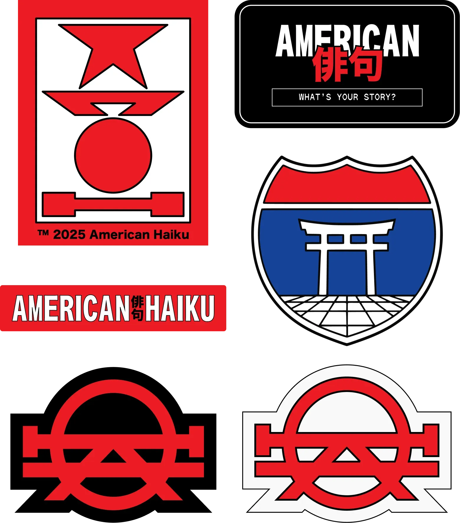
American Haiku wordmark, red geometric symbols, and a blue highway-shield graphic.
The studio marks.
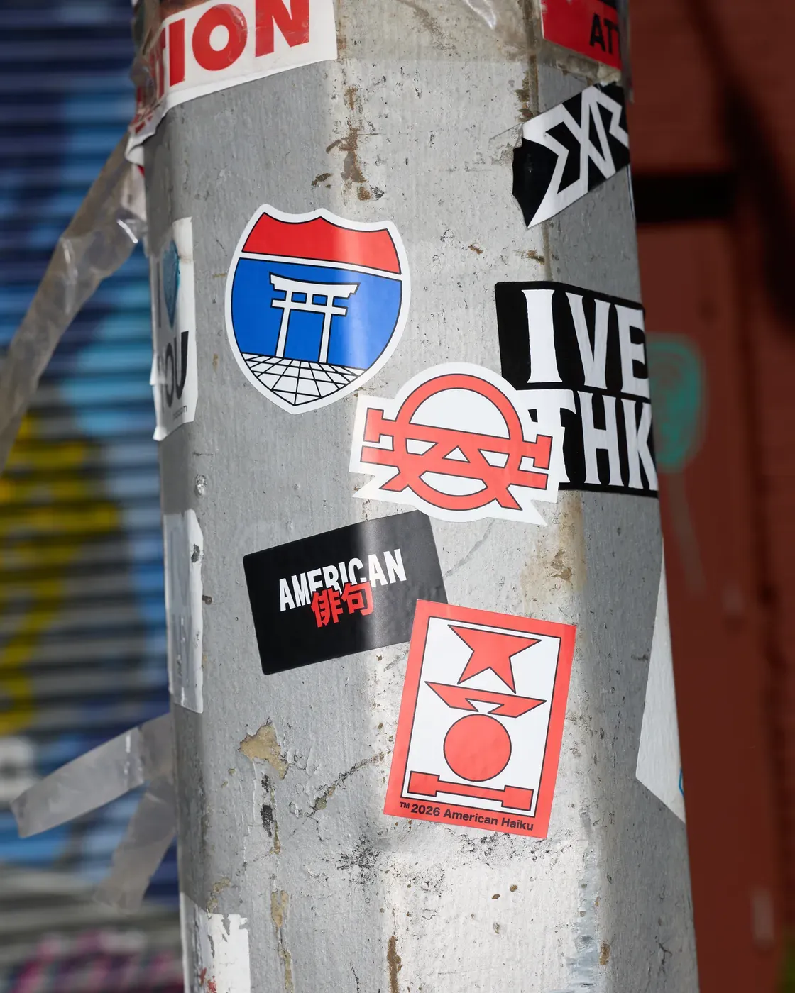
Red and blue American Haiku stickers layered among other stickers on a street pole.
Out on the street.
The launch shop, from flight jacket to notebook.
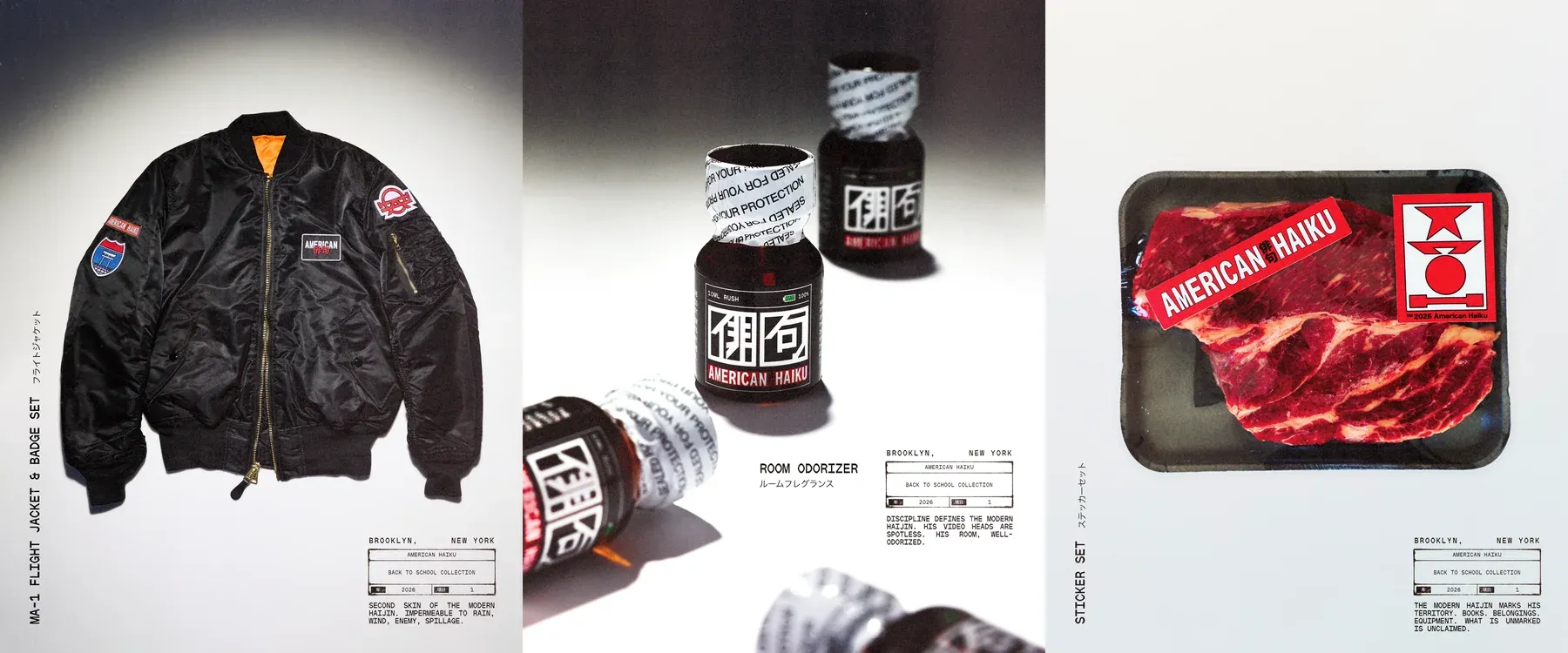
Three launch sheets showing a black flight jacket, bottled room odorizer and a packet of red stickers.
Three sheets from the launch press kit.
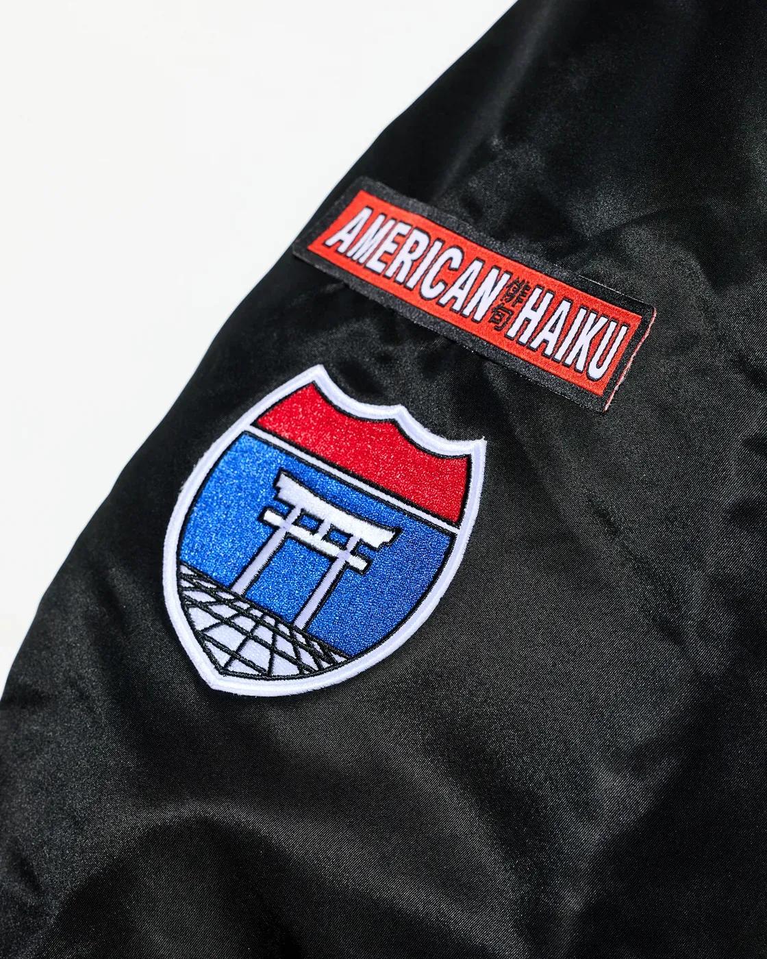
Blue highway-shield patch with a white gate stitched below an American Haiku patch on a black jacket sleeve.
Flight jacket, sleeve detail.
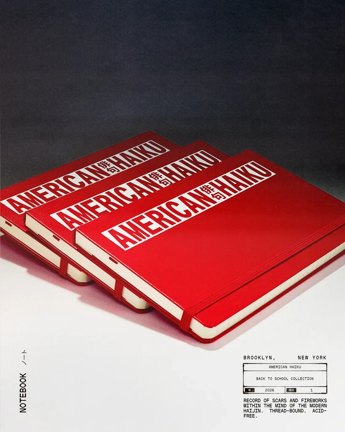
Three red American Haiku notebooks on a pale ground with a small printed catalogue label.
Studio notebooks.
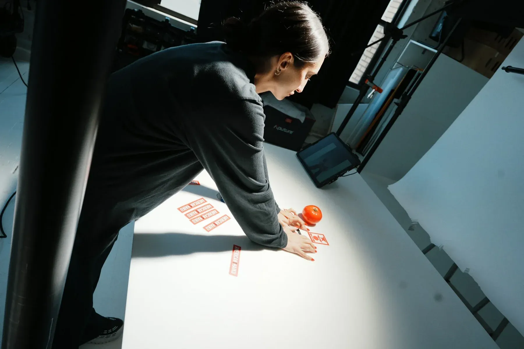
A person leans across a sunlit studio table to arrange red printed pieces.
Setting up the studio shoot.
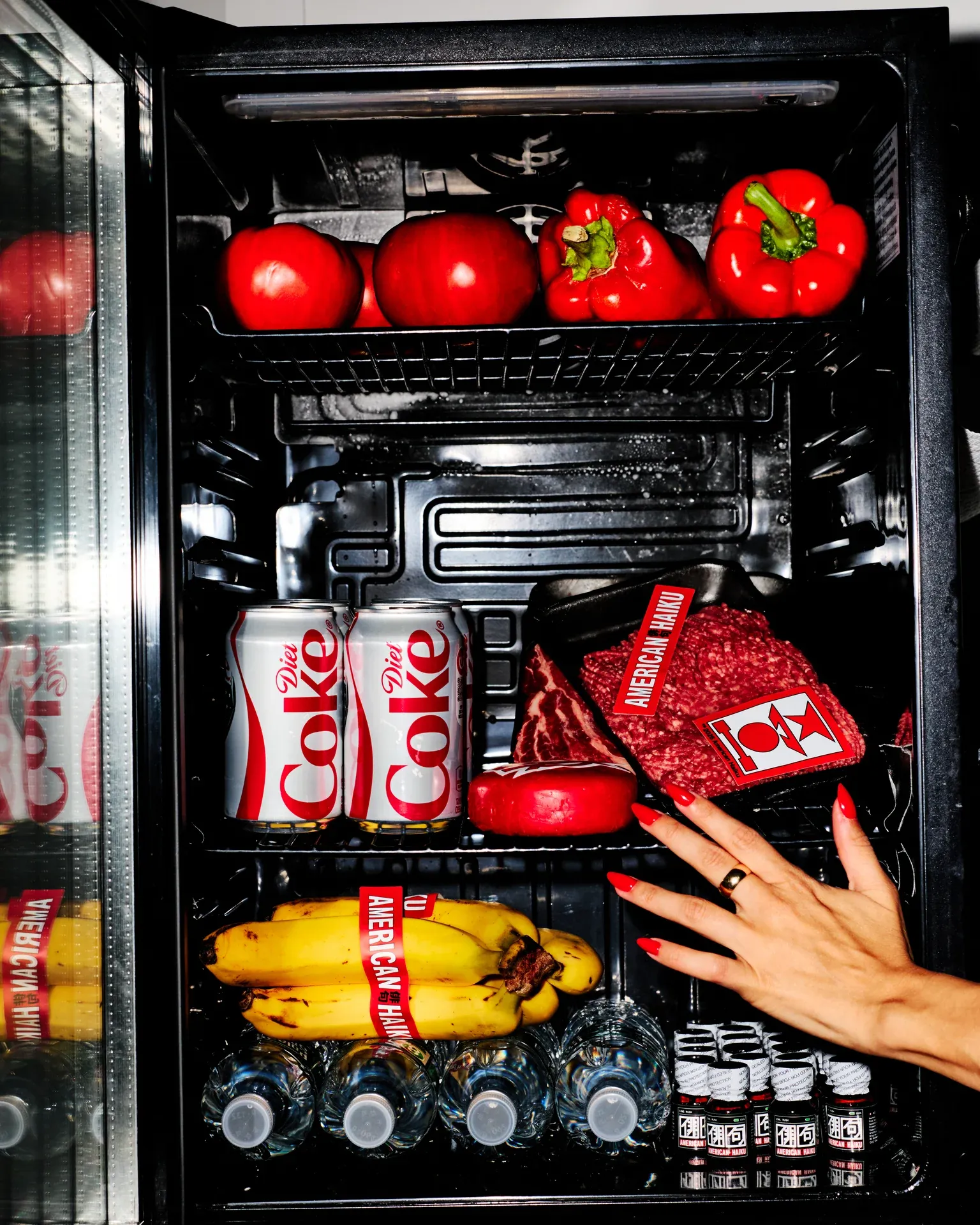
An open black refrigerator holds red hats, cans, and bananas as a hand reaches inside.
Inside the launch fridge.
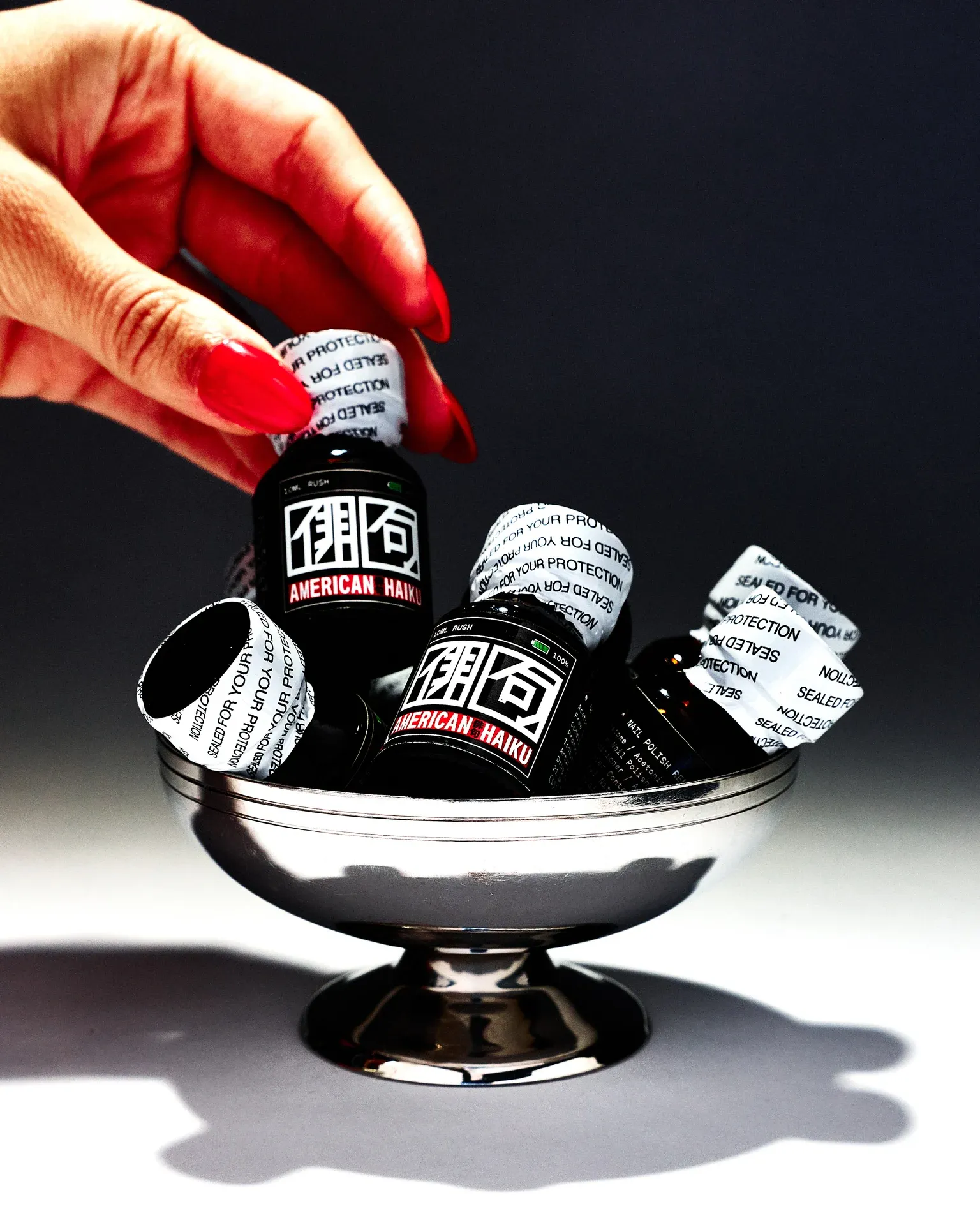
A hand holds a small red-capped bottle above a black dish filled with room-odorizer bottles.
The room odorizer.
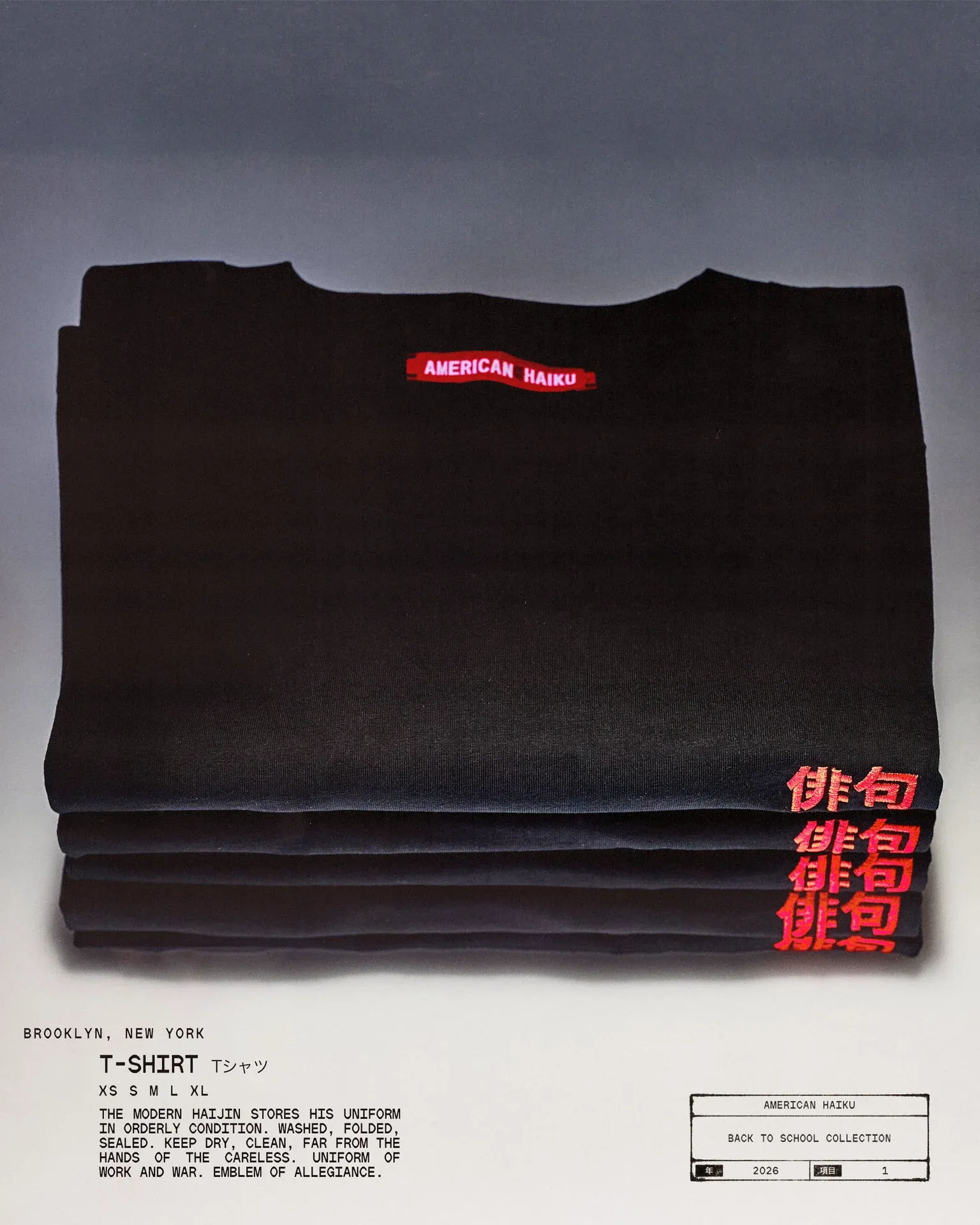
Folded black American Haiku T-shirts with red lettering sit above a small catalogue label.
The T-shirt catalogue sheet.

Project notes

Thom Glover and I had worked together at Droga5. When he and Christine Distasio started American Haiku in collaboration with Love Song, I joined as a design partner. We took our cue from the studio’s name: how much could a few well-chosen marks say?

I worked on the website’s opening titles, cursor and scroll behavior, helped shape the merchandise, and designed materials the team took into pitches. We put the same highway shield on a street sticker and a flight jacket. In vinyl it had a clean edge. In thread you could see every stitch.

Brand
American Haiku
Year
2024–25
Role
Design partner / Creative collaborator