
Campaign · Key Art
New Balance
Rosalía
Rosalía as the protagonist. New Balance as a cinematic world.
Project Overview
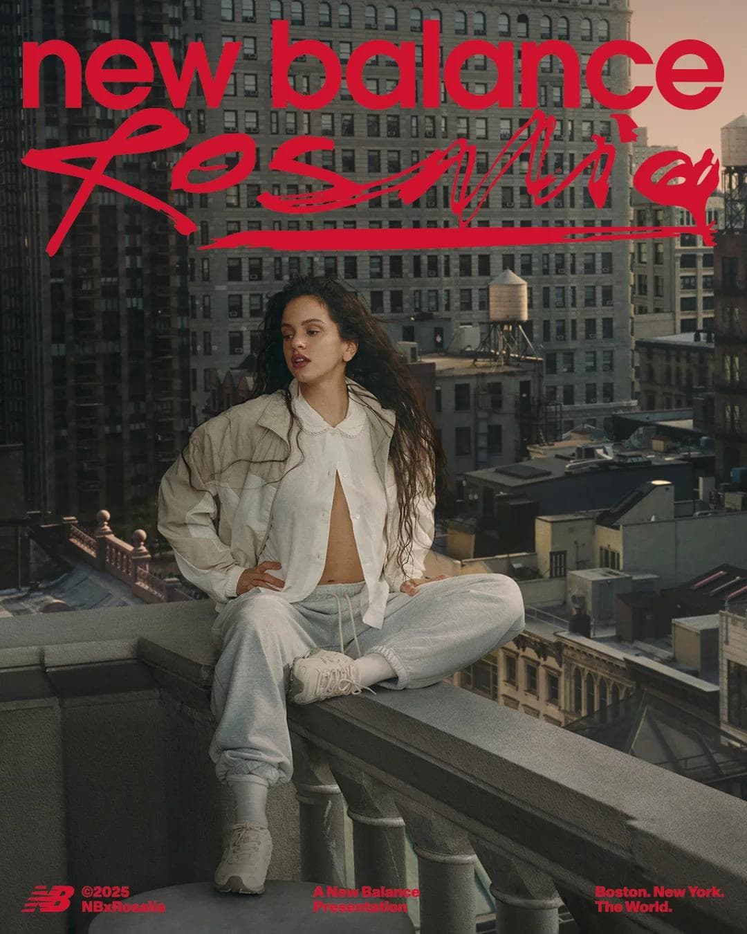
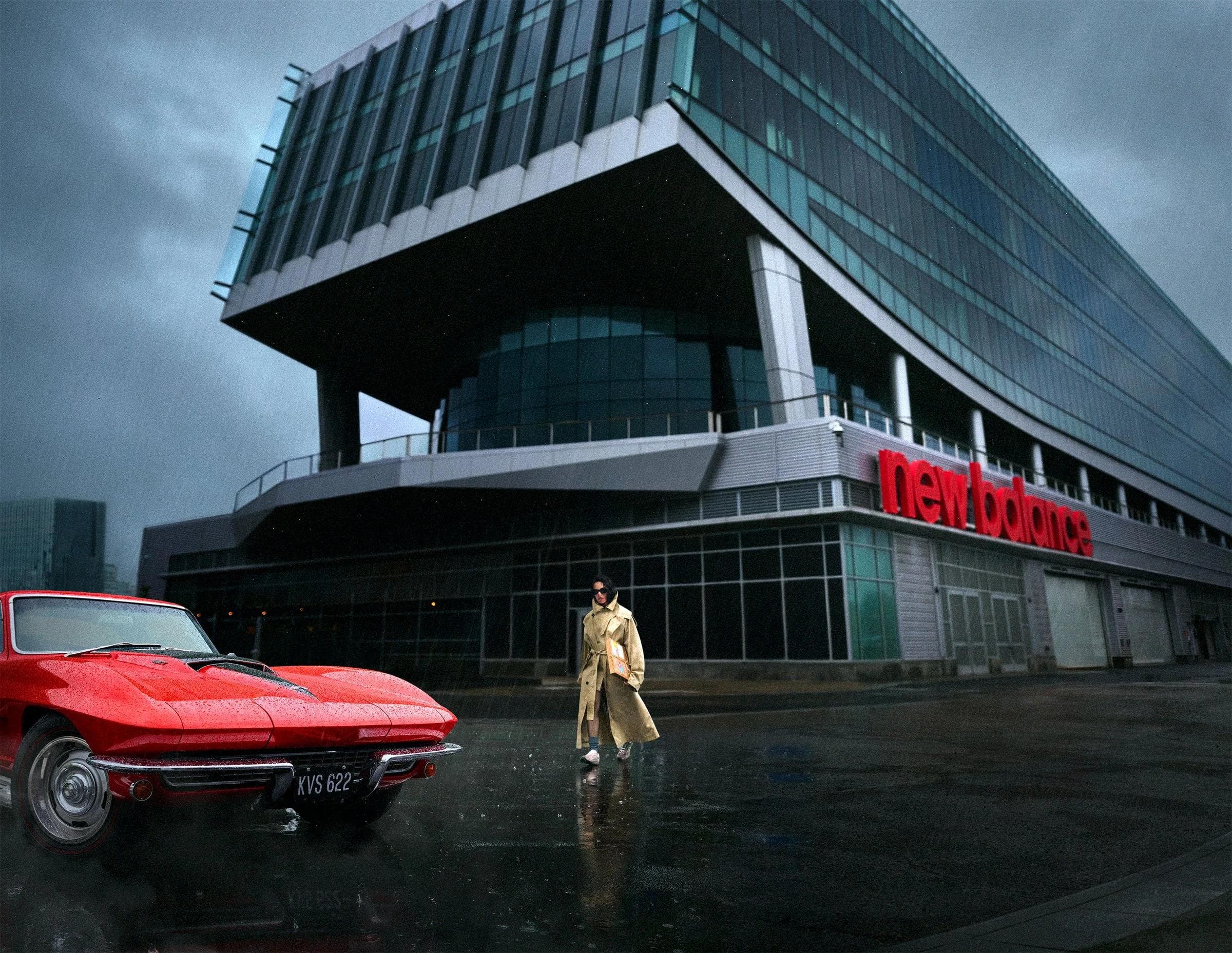
New Balance's Rosalía partnership was an opportunity to build a world around the collaboration. We approached it as an original story, with Rosalía as its protagonist and the campaign unfolding scene by scene.
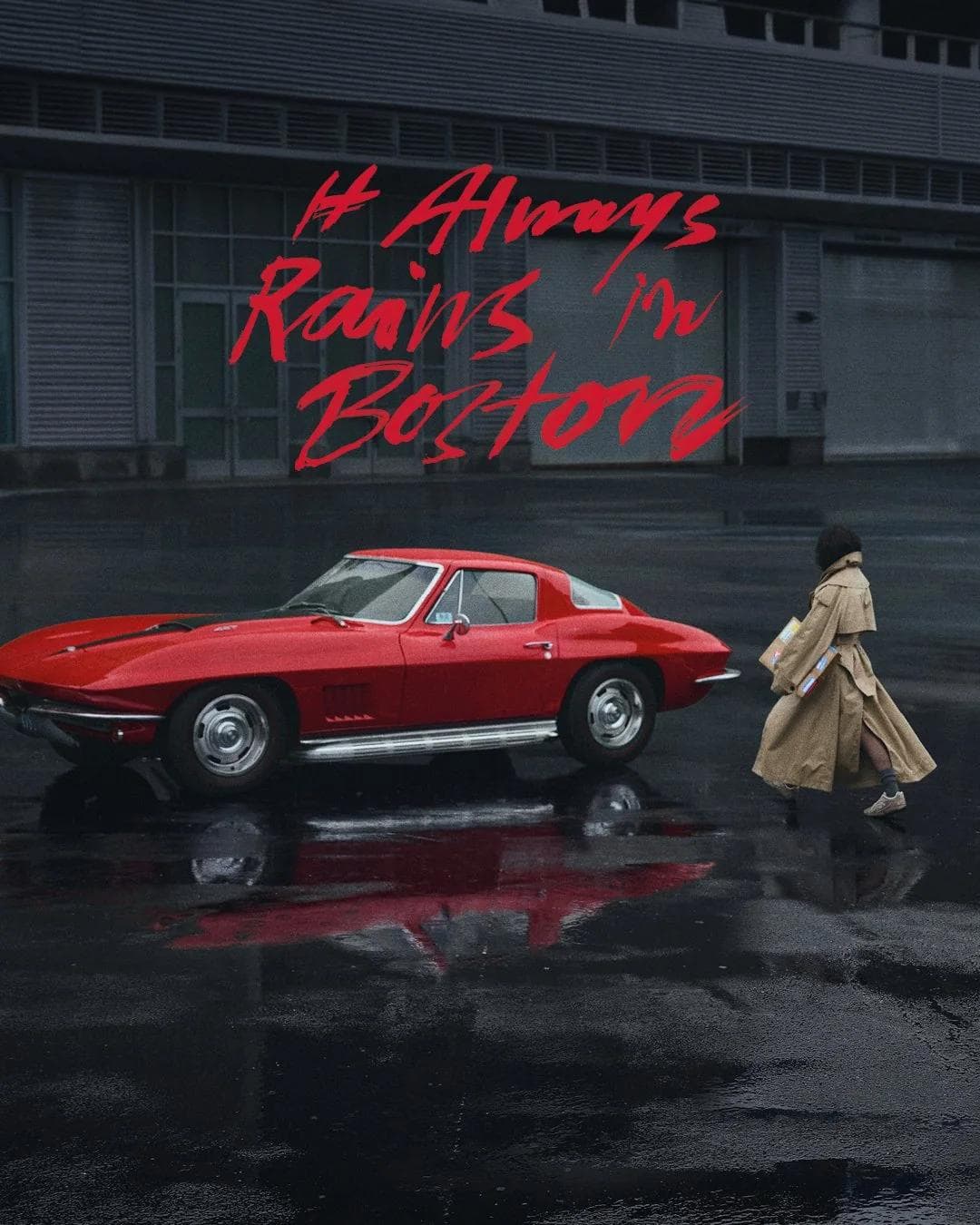
The Ambassador moved through five chapters: Headquarters, The Drive, The Arrival, The Boardroom, and The View. Photography by Alex Prager, lit by Robert Elswit, gave the work a staged, cinematic quality. Each image could hold its own as a poster while contributing to the larger sequence.
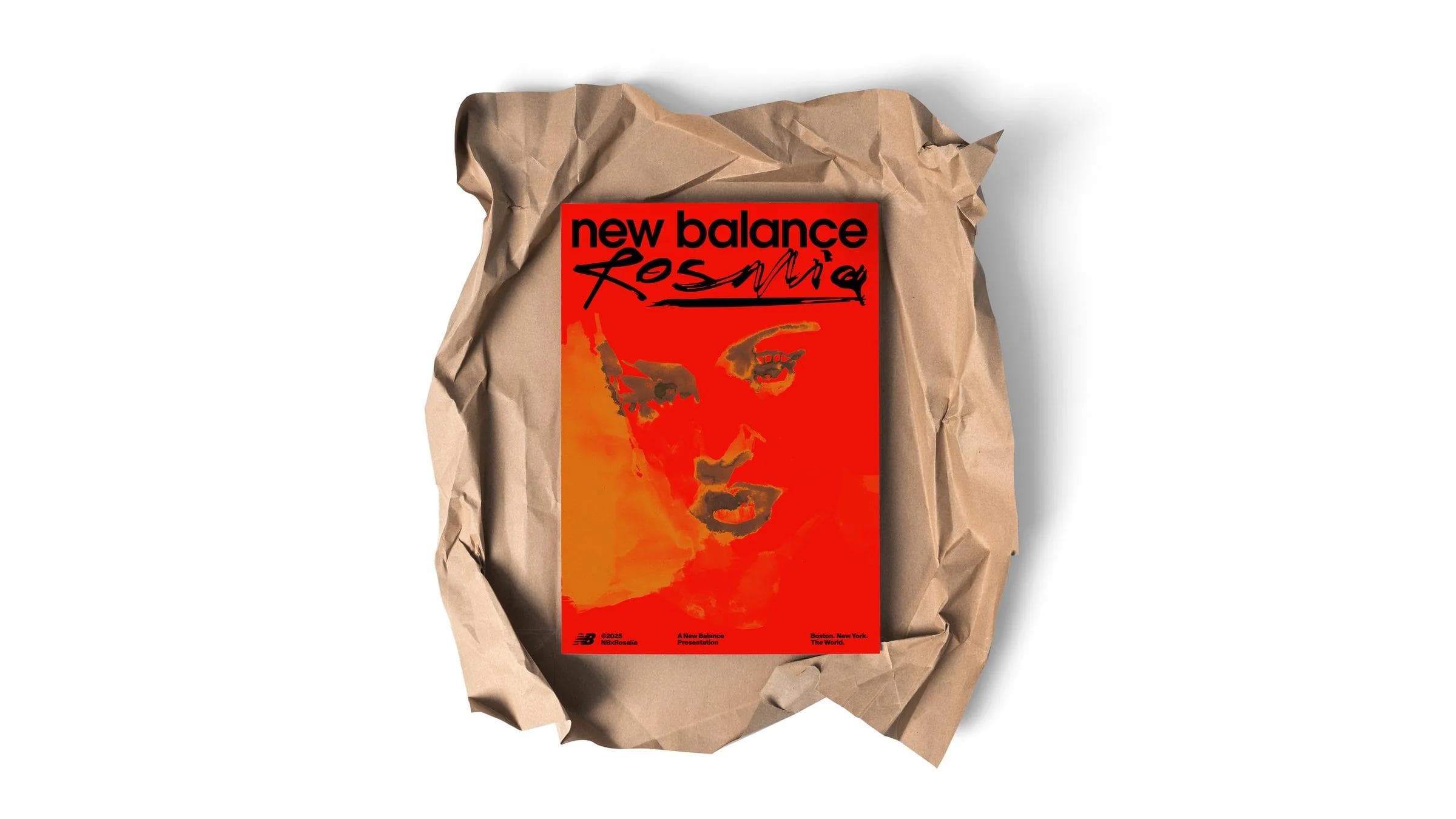
The identity borrowed from film titles, graphic novels, and found dossiers. Handwritten annotations, stamps, issue numbers, and red and yellow poster systems carried the story across out-of-home, social, print, and retail.
The result was a connected campaign in which the partnership could unfold over time, giving every new scene a role in the same story.
- Client
- New Balance
- Year
- 2025
- Role
- Creative Director / Platform / Concept / Craft
Agency / Studio
American Haiku
Photographed by
Alex Prager
Team
- Robert Elswit